A journalist’s job is to get to the truth, or at least the point, so the reader can be more informed. Data can help expose facts that help a journalist tell important stories. Sometimes, visualizations of the data themselves can tell the story.
Maps help unlock geographic data from the shackles of data sheets and sources. That’s not to say rough data is a bad thing. A database is a great way to store, sort, and evaluate data. Often another tool is needed to extract useful information from a database or spreadsheet. When there are places involved, a map is your best way to display your data.
Journalist can tell stories, in the field or in the newsroom, and build engaging narratives with data-driven visualizations.
Data visualization through maps
It’s no secret that data visualization has found a home in journalism. With the explosion of online news coverage over the past decade, journalists, reporters, graphic designers or scientists have formed an unlikely alliance to tell stories with data and visually enhance web-produced content. The graphics and interactive visualizations that have emerged from this relationship have changed both audiences and newsrooms in mainstream journalism outfits around the world. Now, a reader can explore data sets and compose stories along with guidance from their favorite muckrakers, giving unprecedented transparency to the news-gathering process.For newsrooms, scientists or designers now hold a place of privilege as journalists vie for their overbooked time in the hope that they can get an interactive component for their latest story package. A good visualization component not only earns a story more reads, likes and shares than a conventional text piece, it typically has a longer trail of activity as readers keep coming back. With budgets already tight across the industry, multimedia journalists need to start taking it upon themselves to learn the tools of their medium to make the most of their resources. Not all, or even most, reporters will be coders or designers in the near future, but fortunately there are enough user-friendly data storytelling tools for all levels of technological skill to allow the average journalist to whip up a compelling interactive map, timeline or chart without using advanced computer skills.
Perhaps one of the most difficult tasks in journalism is to give readers a sense of geography using only the written word. If a reporter does include a map, oftentimes it is some variation on a Bing or Google map, which is functional, but could be more aesthetically pleasing and offer more options for incorporating data.
As creative studio we design a vector map collection that was created having in mind what graphic designers, journalists, students and any other people may need to create visually appealing maps easily and quickly.
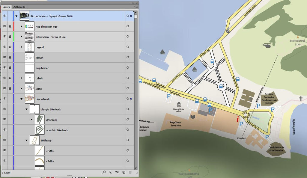
Thanks to the Rio 2016 Map layered maps, anybody who knows how to handle a current vector graphic design program, especially a program like Illustrator, can easily shape their own maps.
Editable maps using layers
Everything in our maps is editable. The distribution of thematic layers is designed to quickly create different types of maps through their activation and deactivation, change in distribution and, of course, edition. Yes, everything in our maps can be customized.
Objects, polygons, polylines, layers, colors, texts everything can be changed easily to create the desired map. Also, the user won’t have to rely on a different graphic design tool (you can use Illustrator, Photoshop, Inkscape etcetera), nor have to use any complex mapping software Geographic Information System.
Benefits for designers
Map information is often out of reach for designers or graphic design programs users. Would not it be great to have a collection of maps designed as templates to create new, customized maps not needing to use Geographic Information Systems or similar programs?That’s where our map design studio comes in. When creating vector maps, we always had in mind the ideal map pack in our daily work as graphic designers. Using Illustrator as vector design tool, you can create and edit any kind of map element.
Map formats
Our maps are layered .ai, .eps or .pdf (requires Illustrator CC or higher or other similar graphic design software).Map layers
The magic behind our maps lies in its structure. All the maps that make up we have been designed to be easy to use. To achieve this goal, each map has several layers of information distributed on separate thematic layers.These layers can be turned on or off, you can edit them, copy and paste or even merge them. There are layers of streets, roads or railways, rivers and lakes, neighborhoods, Olympic venues, text labels, hotels, hospitals, musea, airports, bus stops and subway stations. Playing with the arrangement of the layers and the elements that compose them you can create countless maps, all of them meeting your needs.
Range of application
There is no limit to what you can do with our Olympic maps. We created this vector map Rio bonus pack thinking about the work of any graphic designer, Web designer, journalist or anyone else in need of creating maps quickly and very easily.Editing the layers of each of our maps can create thematic maps of Rio de Janeiro, create visual representations for computer graphics or similar. It doesn’t matter if you want maps for print or for web use, our maps adapt to all uses.
Being built in vector formats, they can be scaled to any size without losing image quality. Therefore, you can create high-resolution maps for publishing or even to give life to a large area but you also can create maps for websites or interactive maps. Each point, text, line, or polygon of the maps in the bonus pack is fully editable, so it becomes a cartographic toolbox easy to handle at your disposal.
Mapping process
There are plenty of cartographic sources availabled, but unfortunately they are typically designed for use by cartographers, engineers and geographers who use for their projects Geographic Information Systems. Generally, graphic designers, journalists or anyone else outside the world of GIS often have great difficulty in handling these cartographic databases.When what is needed is to create visually appealing maps and accuracy and spatial analysis tasks are something you do not need, such complex system become a tempting target, but, at the same time, a headache for those without cartographic tools or the knowledge to take advantage of them.
Our Rio 2016 maps are created thinking in graphic design in the visual, to communicate information easily.
Each vector object created this way has subsequently been edited by one of our map designers when the occasion demanded it, as it happened with text labels, elements of color, thicknesses and other graphic aspects. The result is a vector map created just to have on hand a number of ideal quality templates when designing visually appealing maps.